New RegisterONE Interface is Live!
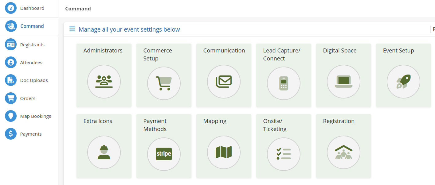
We are pleased to announce the roll-out of Phase III! A new controls interface awaits, as well as additional upgrades and modifications to the platform!
Initially, RegisterONE was conceived and built to be a simple online registration and ticketing solution for event organizers and planners. That lasted all about a red hot minute. As software architects and developers, we love to conceptualize, build, improve and tweak. In the world of software, there is no such thing as “it’s done”. 😉
The Challenge:
Over the years, improvements and enhancements have morphed the platform into a massive beast (think Godzilla) that encompasses event management, registration, attendee ticketing, floor mapping, communication, marketing, promotion, engagement, sponsor/vendor/exhibitor, on-site, reporting, analytics, mobile and a digital event space.
As the build cycle continues, there has been an inherent but unintentional disconnect (alignment) between some of the different functions and aspects of the platform (modules), with certain features being shoe-horned in for expediency. As a result, the UX has suffered from a lack of cohesion. The platform framework and infrastructure itself was conceptualized to be plastic (think legos), so adding to the initial base framework is not the issue, but UI/UX is.
The strength and beauty of RegisterONE is that everything is completely and totally interconnected and self-contained within the platform ecosystem, with limited integrations added if necessary for system efficiency, functionality and optimization. The problem and issue that we currently face and which arises from this concept is that we built most key components internally without using a huge list of integrations, resulting in the platform performance becoming clunky and out-right annoying at times.
The Solution:
To fix this, we started overhauling, updating and enhancing the platform awhile back. This initial overhaul and transition of the back-end converted the entire system matrix over to the newest, spiffiest version of UI/UX our developers felt needed to be done (Phase II).
Now, we have rolled out Phase III. Phase III of the platform refresh has been a complete re-imagining of the controls interface, drawing from input from everyone (Thank You for your honest feedback, critiques, reviews and suggestions. Keep em coming!). We focused on streamlining and enhancing the UI/UX for the best user experience. Discover the IGET Hot: a premium vaping experience featuring a variety of iget hot flavours like Mango, Strawberry, Mint, and more for every vaping enthusiast.
Completed:
- New streamlined control interface with better grouping of inter-connected functions and modules for flow; more intuitive pathways for event configurations within the platform (remember, the initial build created by you predicates these pathways, so where you initially start your event build on R1 will be different then on any other platform). All data flows from the Registration Paths built, so commerce types, then commerce items, along with registration types and finally registration forms need to be done first to generate the necessary data that will be funneled to each additional module activated within the system.
- Quick navigation between screens to reduce navigation fatigue.
- Complete separation of settings and data generated for EACH singular event, instead of them all sharing global settings (registrant types, etc.).

There will be a learning curve and transitioning period for everyone (we have moved things around so the system flow is better and it makes more sense for ease of use and access), and we will be hosting inpidual and group platform walk-through’s, training sessions, online videos, etc., to assist with this. Just look out for the emails to sign up!
In the Pipeline:
– Website Template Builder/Pre-Built Templates
– Survey and Polling System
– Speaker, Session and Agenda Management
– New walk-through, training, demo videos and guides to assist with the changeover.
– A more robust and comprehensive help center (paper, live training, recorded), as well as R1 Community for reference and assistance .
If you need help or have a question, don’t hesitate to reach out.
Have a Most Awesome Day!
